
Is it all about serenity? Or is it just that Pantone, the color consultant company, generated a clever marketing campaign for 2016’s unlikely pair that inexplicably adds up to its “Color of the Year” — rose quartz and “serenity”? Who knew that serenity was a color?
“Blue is a reliable and responsible color known for its calming effects. It’s perfect for a space where you want to be peaceful, serene, and calm,” says Ron Scharfe, owner of RS Design, a color consulting and design agency. Good to know the serenity factor is more than just marketing speak. “Blue can also be energetic when its bright tones are contrasted with white or yellow.”
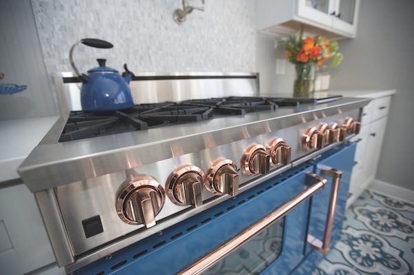
BlueStar range with rose gold knobs, all from Ferguson.
Blue, a primary color, is by far the most popular color family and the color most preferred by men, says Scharfe. “Blue is embraced as the color of heaven and authority, denim jeans and corporate logos. It is cold, wet, and slow compared to red’s warmth, fire, and intensity. Conservative in its darker tones, blue becomes breezy, cool, and modern when you add white.” Scharfe’s clients rely on him to coordinate color, texture, and finishes from full interiors to exterior. His eye for hue guides critical long-term decisions and prevents major mishaps.
“People rarely go with what’s trending,” Scharfe says. Blue’s mass appeal trumps any trend, but Scharfe warns it can be overused and wind up as a design cliché if used alone. His tip: Combine blue with another color for a more creative effect.

Bue bath fixtures from Kohler.
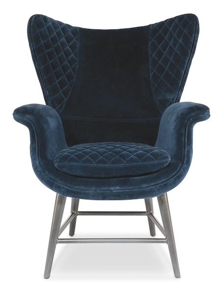
Mod Wing Chair from Grace Home Furnishings.